Pearl of Shwebo

Promising Quality: An Emblem of Authenticity
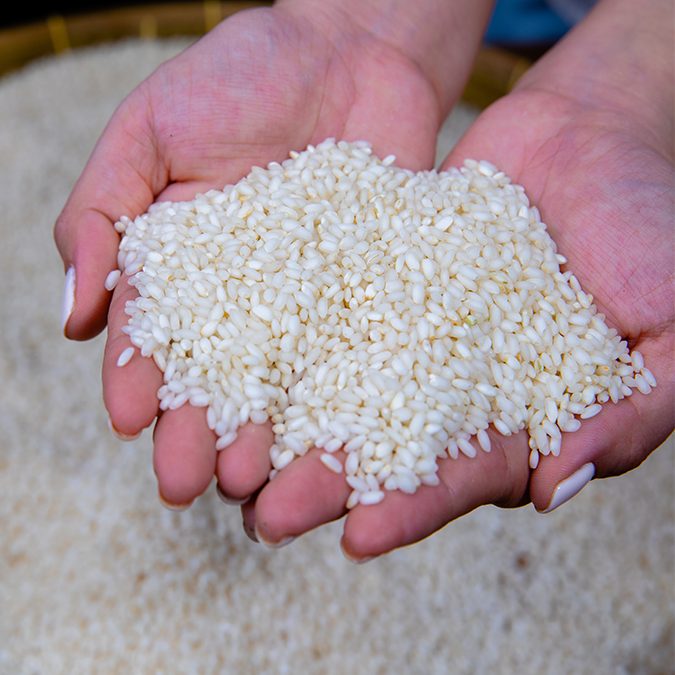
Sometimes referred to as the “pearl” or “jewel of Shwebo”, Shwebo Pawsan Rice is more than the pride of the Shwebo community. The produce known for its unique physical attributes and premium quality sustains the livelihoods the community. It is a representation of the community’s dedication and commitment to excellence.
The French Development Agency (AFD) is currently funding a new regional project to further support Geographical Indications (GIs) in Cambodia, Laos, and Myanmar. Specifically for Myanmar, the project focuses on ShweBo Pawsan rice, a white rice variety grown in ShweBo district, Sagaing region.
With
GRET
Objective
Develop a GI quality trademark for Shwebo Pawsan rice
Demographic
Actors in the rice value chains including farmers, merchants, millers, traders, retailers, consumers, International rice/GI associations
Types of work
Branding, Strategy Research & Evaluation, Design
Themes
Agriculture, Livelihoods, Economic Empowerment, Cultural Heritage
Links
SPFMTA Facebook page

Challenge
People in the market mix other rice with Shwebo Pawsan to sell as the renown Shwebo Pawsan rice under pretense. This has negatively affected its quality image and price.
Approach
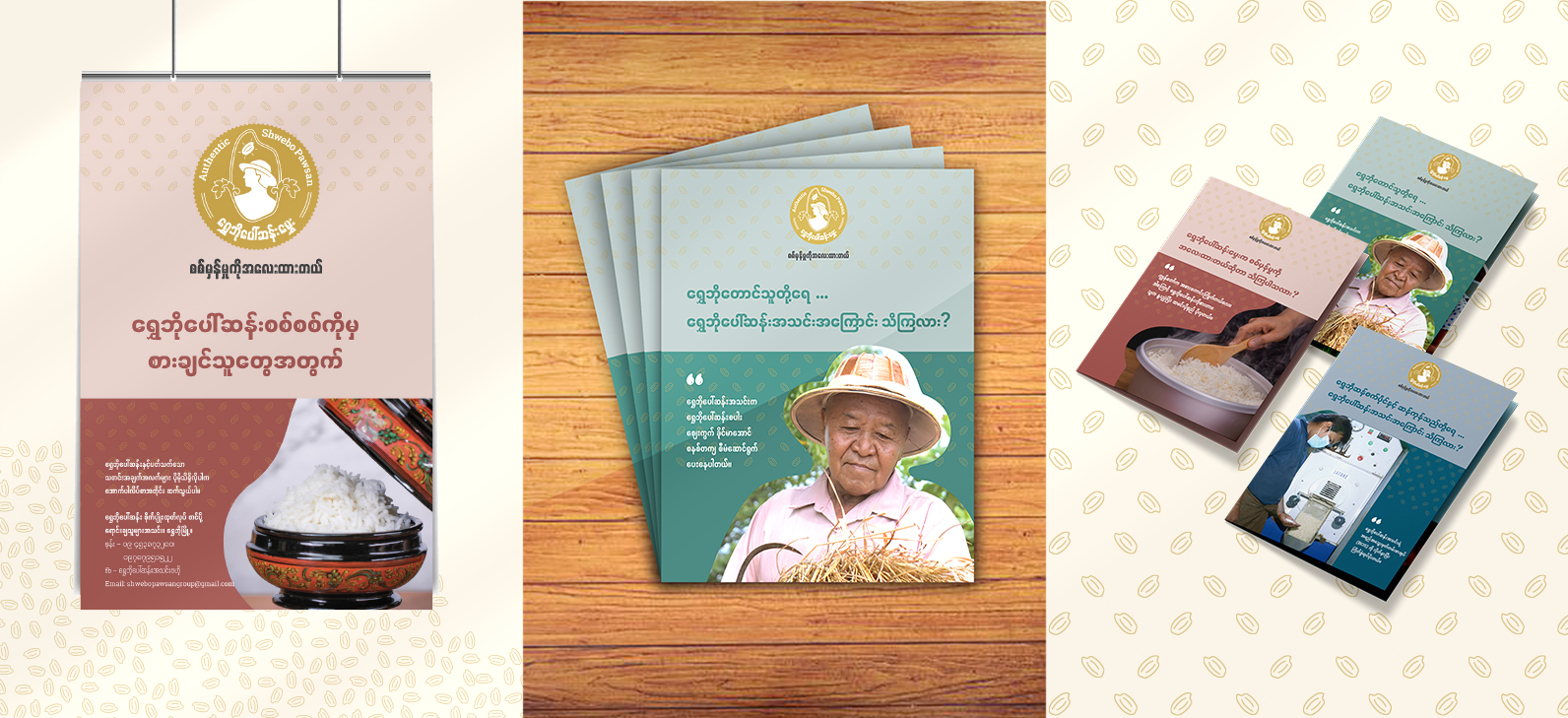
The solution of this problem is to create a Shwebo Pawsan GI trademark. This stamp of approval and a promise to all stakeholders including consumers that the product has been quality tested by SPMFTA to be of its utmost purity and quality.
This is also a perk of becoming a member of the SPMFTA - reassurance in the quality of the products, with the goal to expand into the international markets in the future.

Strategy
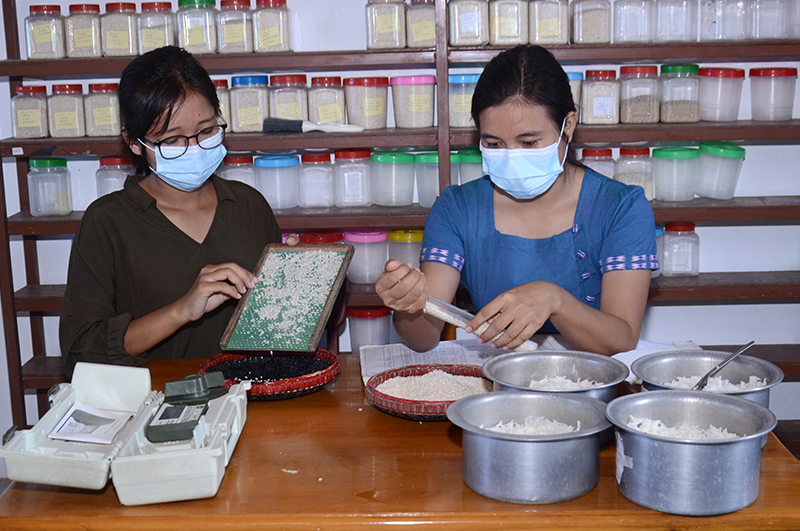
As an integral part of our research, we engaged in interviews with key participants across the value chain. This involved discussions with SPFMTA member and non-member farmers, a Shwebo miller, a trader, a Shwebo Pawsan consumer, and two consumers who didn’t normally consume Shwebo Pawsan. These interviews yielded valuable insights, including the identification of instances where Shwebo Pawsan is potentially mixed with other varieties in the market.
Additionally, our findings indicated that the successful implementation of the Shwebo Pawsan brand is linked to the sustainability of the SPFMTA association. It is important to not only promote Shwebo Pawsan rice but also actively support the SPFMTA association. Therefore, a holistic promotional approach is used to encourage the use of GI logo across our audience.
Creative
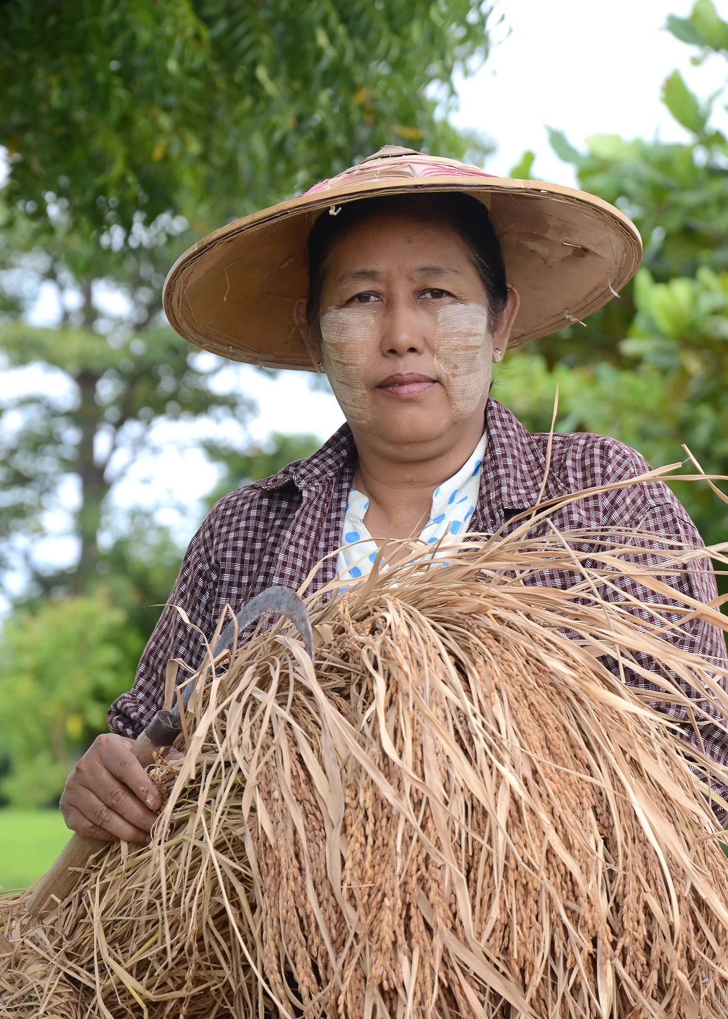
Shwebo farmers are at the centre of Shwebo Pawsan rice. The role they played in preserving the authenticity and purity of their rice was crucial, and their cultivation practices reflected a unique commitment to discipline and meticulous attention to detail to this cultural product. We successfully concluded the logo design process, arriving at the finalized version known as the Shwebo Pawsan logo.
Logo and brand guide
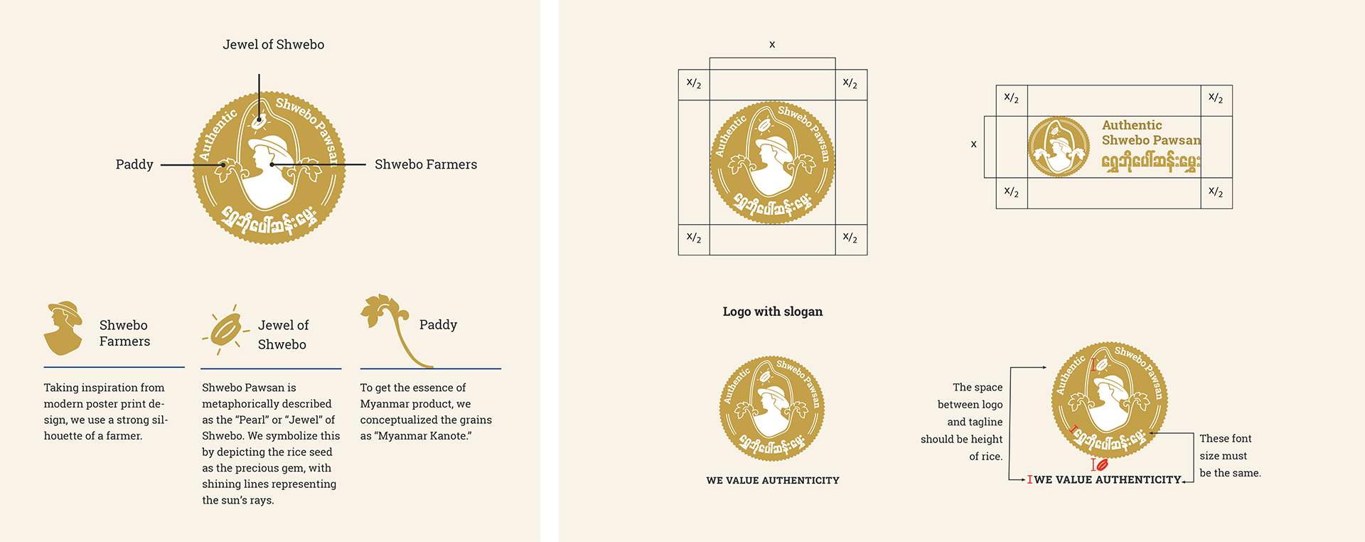
Brand fonts and brand color


Gold
Represents the paddy.
Black
Creates contrast to make the text more visible.
Blue
Represents machinery and technology as well as water and the sky.
Green
Represents the green paddy fields.
Brown
Represents the earth with a focus on incorporating red tones to represent Shwebo's soil type.
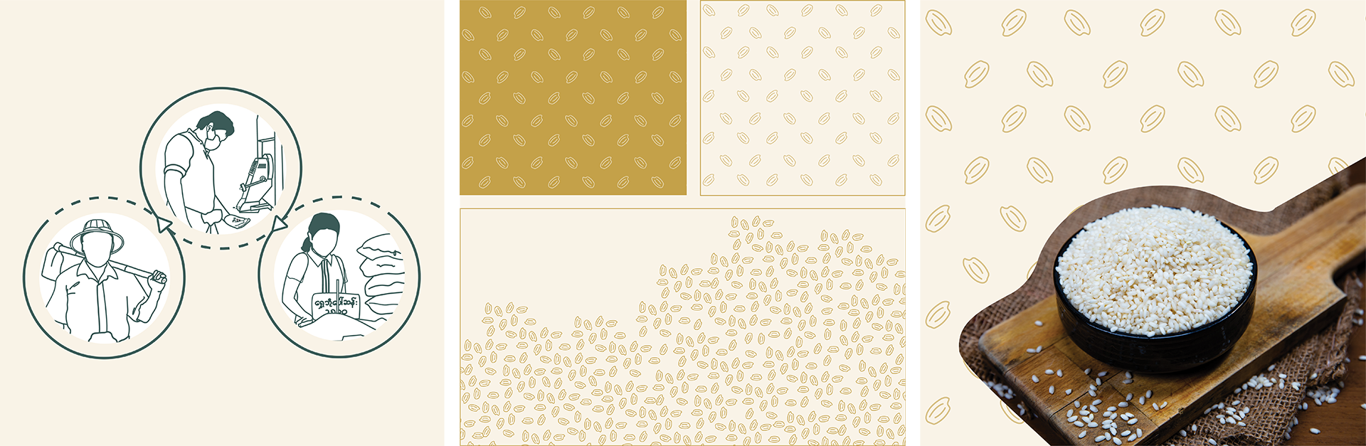
Illustrations, graphic patterns and photo layouts
Social media

Marketing Materials